For a developer, the main concern regarding launching his app should be the first impression that the app makes for users. At this moment we are talking about app onboarding, the process of presenting an app for the first time in front of users. If it is done the right way, this leads to the success of the app and the guarantee that people will enjoy using it over and over again and, why not, they will spread the word about it.
Importance Of App Onboarding
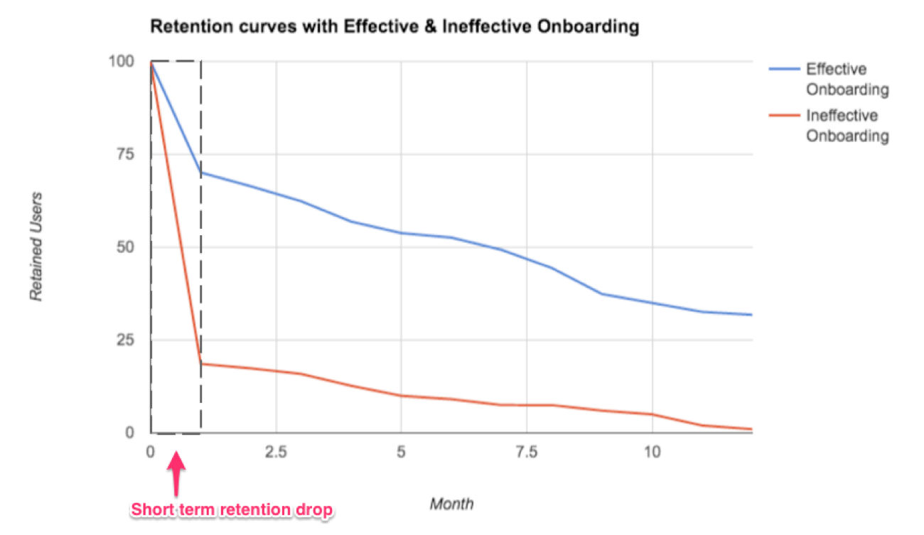
While 80% of apps are deleted from the first day, it is no wonder why we should make everything that is in our power to engage users and to offer them an onboarding flow easier to understand and follow. Moreover, according to Kahuna, when using app onboarding properly, the user LTV grows to 500%. The chart below, showed by Trychameleon proves the difference between an app using onboarding advantages and the same app not using them, in terms of retention.
7 Best Practices of Effective App Onboarding
To be sure that people use your app, you have to show them how to do that. Be careful though, avoid to be boring and use the latest improvements in technology to offer your users an unforgettable experience and to make them wanting for more.

Show Value Not Only Features
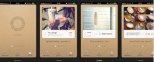
While it is so easy to list all the features of an app, it is always better to highlight what the app can do for users. This way, they understand better the benefits of an app and in what way that app can make their life easier. They will appreciate this from a developer instead of throwing a bunch of technical ideas in their face. A great example of this is Simple, a financial app, and these images are the proof for its name.
Don’t Ask For Too Much Personal Information
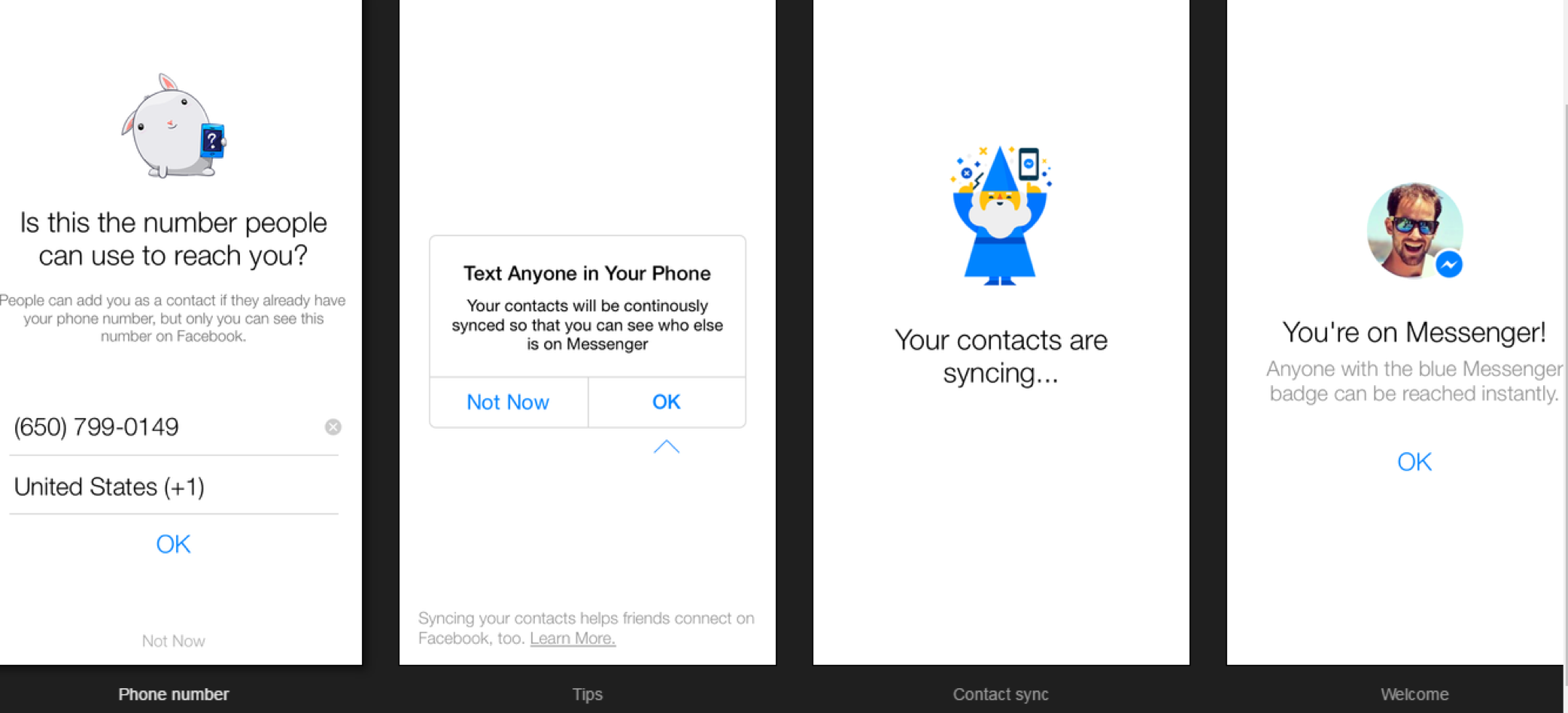
If you ask for permissions or if your app needs some data from users, you need to choose only the essential information, because asking for too much, too early will cause your user to uninstall the app, or not installing it at all if they see a long list of permissions on app store page before downloading it. For example, Facebook Messenger asks only for the phone number, adding a Not Now Button if the user wants to skip this step for the moment.
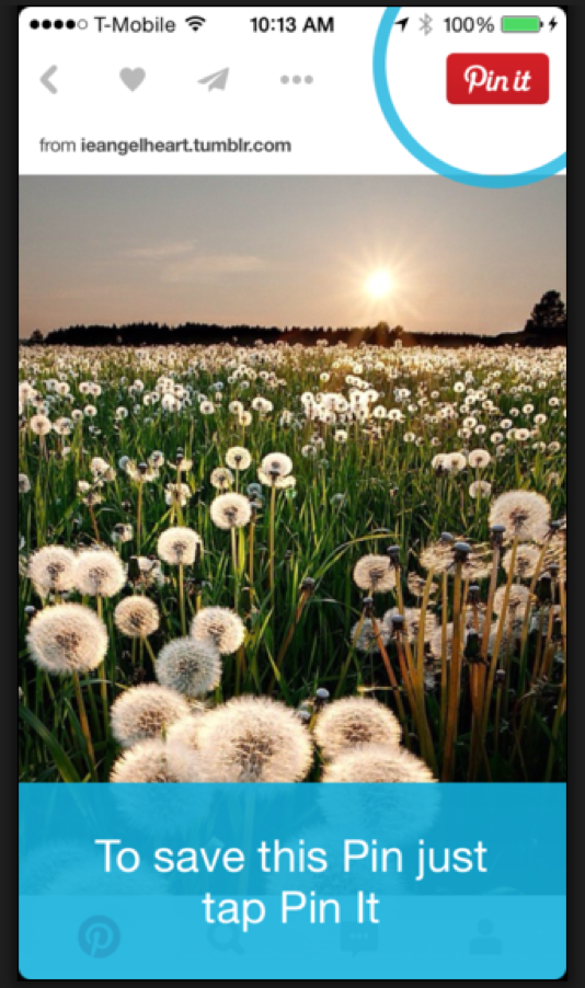
Let Users Take Action In The Meantime
An app has to be interactive. A great solution is to guide them step by step when they complete their tasks at the same time. Look at Pinterest and how it explains to its users how to save the pin. This is one of the reasons why it is so appreciated by its adepts.
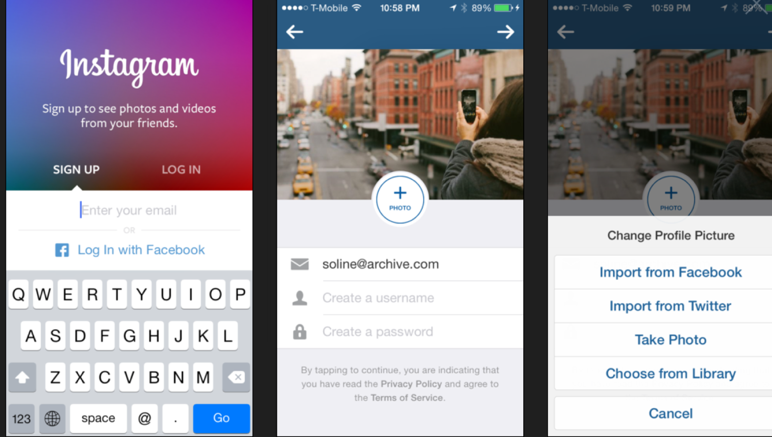
Make Signup Process As Easy As Possible
A recent study shows that, while the reason for user retention is useful information, complicated registration makes them uninstall the app. If the user struggles from the start for connecting to your app, you will end up losing him. Some users prefer to sign in with their email or with social media accounts. Just like Hootsuite, offer them this option and they will be happy to get into your app with 2 simple steps.
Progressive Profiling
Progressive Profiling allows user to build his profile gradually over the course of a series of app screens, instead of asking all the information once. Keep it simple and request only the most important data from users. You have to focus and not going too much into details. Keep in mind that if you lose him, you won’t even need that data. If you engage your user you will have plenty of time to ask the rest of the information later.
Don’t Use Too Much Text
Your app is not a novel. Use images to explain the steps that your user needs to make within your app. Look at this eloquent images from Glowee, a photo, and video app. They are so descriptive that anyone understands what to do.
Use The Best Onboarding Pattern For Your App
Choosing the right onboarding model for your app makes your users involving more in the process.
Tool Tip
Tool tips are small messages that appear on screen with useful hints. They are great as long as they don’t cover important parts of the layout and they come in small number. Offer users the possibility of closing them
.
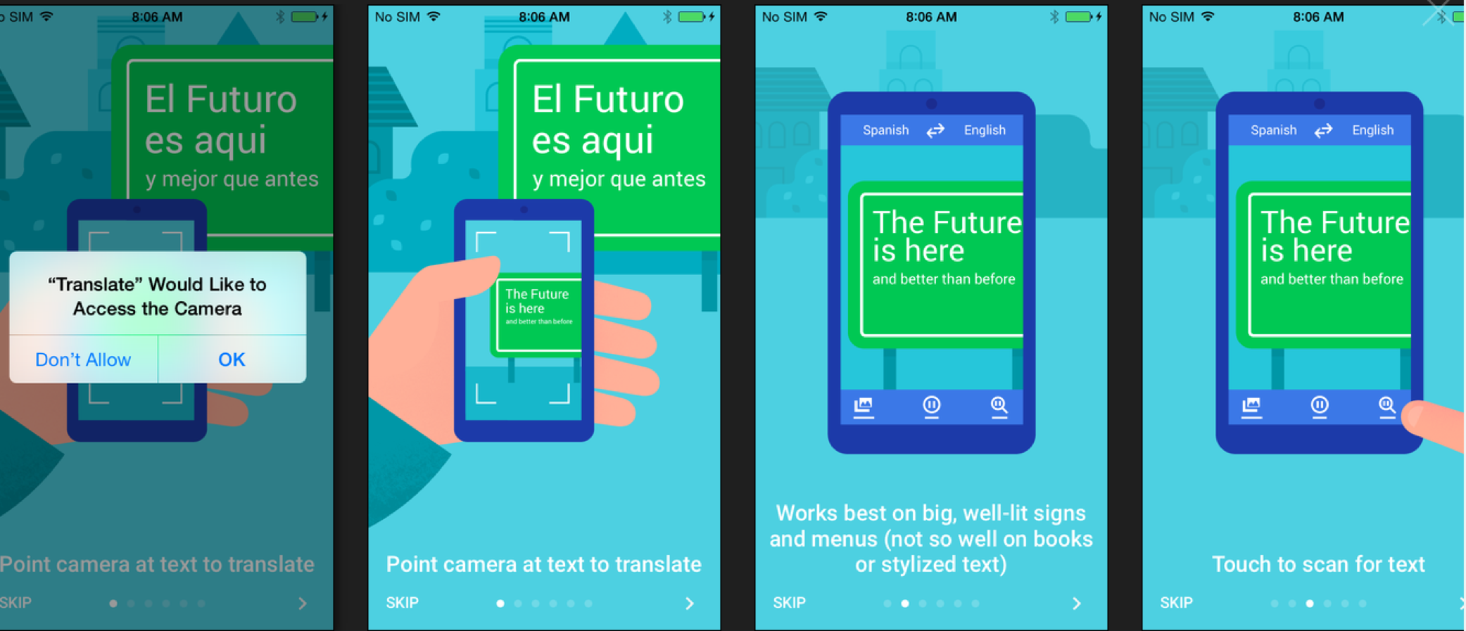
Progress Bar
It is a good idea to use progress indicators that allow your users to have a clue about the number of screens they need to view in order to understand your app. Just like Google Translate, don’t forget to add a Skip button, in case the user doesn’t need the tutorial.
Video Tutorials
Some users prefer to watch an app in action. They like to see what they can do with that app and even more important, how they will use it. For this case, an important media channel to show a video tutorial is YouTube. You can check our previous article about how to increase your app downloads with YouTube and to discover the best practices for making videos to reach your goal.
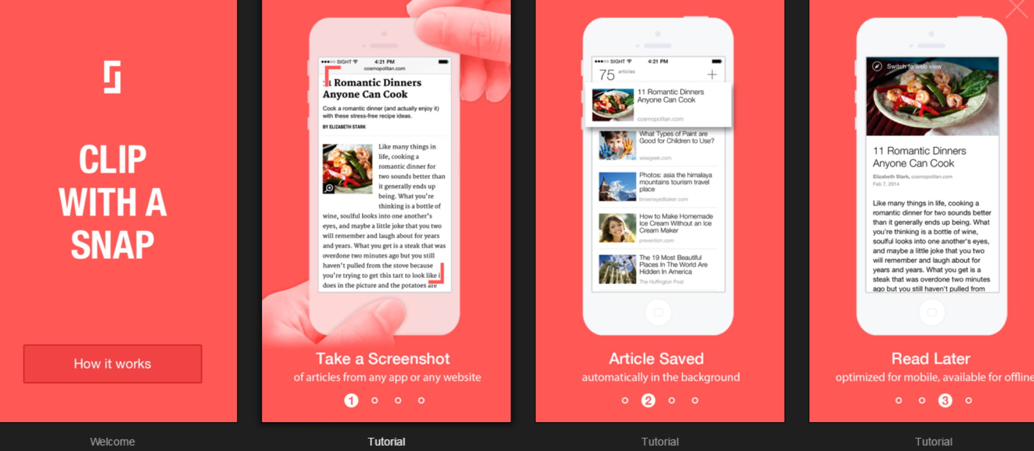
Coach Screens
Using coach screens is a good way to inform your user on how your app works. It is best to show one step on each screen, so the user won’t feel overwhelmed by the quantity of information. Don’t use too many screens, 3 or 4 screens would be enough because you don’t want to be boring. As we explained earlier, it is even better if that data is presented as an image. A great job for this is doing Sight, a news app.
FINAL THOUGHTS
We all know that the first impression matters the most in every domain. This is the reason of making the onboarding flow much easier, interactive and less boring to engage users and to convince them about the value of your app.
Could not generate text due to an error.
Think of app onboarding as the welcome mat to your digital doorstep—it sets the tone for everything that follows. Done right, it’s not just about showing users how to navigate your app; it’s about creating an experience that feels intuitive, seamless, and even a little delightful. A strong onboarding process can turn that nerve-wracking “first date” with your app into the start of a long-term relationship. It’s your chance to show users the value your app brings to their lives, guide them through its features without overwhelming them, and, most importantly, make them feel like they belong. After all, nobody sticks around if the first impression is confusing or underwhelming.
The key to effective app onboarding is to think of it as the first date between your app and the user. You wouldn’t overload someone with every detail about your life on a first date, right? Similarly, a successful onboarding process should focus on making a strong, yet simple, first impression. It’s about building trust, sparking curiosity, and showing users how your app solves their problems or makes their lives better. A smooth, intuitive introduction can turn hesitant first-timers into loyal fans who not only stick around but recommend your app to others. Remember, onboarding isn’t just a tutorial—it’s the opening act of a long-term relationship with your users. Make it count!