During the period you develop an app and even after that you must remain present in online environment. You have to intrigue people with pieces of your work and to let them know what you are preparing for them. A great approach is to build your own website. You are probably thinking: How to create an app, promote it and to build a website in the same time? First of all, we already clarified that marketing your app should be included in the entire process of creation. It is impossible to avoid that. If you can’t manage both sides you should ask for help because the app won’t promote itself. Secondly, a website is part of the marketing strategy. You can start with it and to continue with other techniques presented in our previous articles. Moreover, if you think it is hard to build a website you can create a landing page for your app, which is a single page where you present your app. But, it is mandatory to have one if you want to win in this fierce competition of mobile apps.
Table of Contents
Importance Of Having a Perfect Landing Page
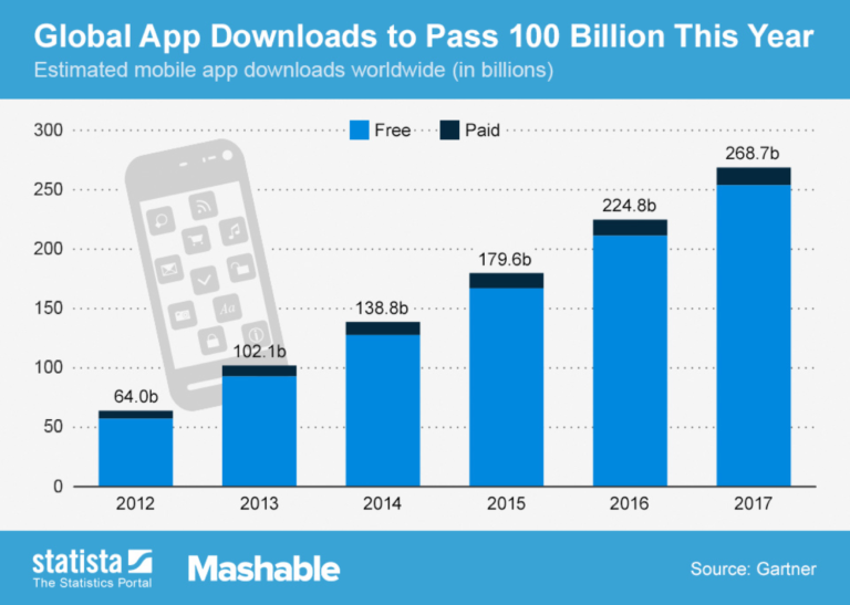
Look at the chart below to discover the number of downloads predicted for this year. Who doesn’t want to represent a part of this situation? For this to happen, you must be prepared in every possible way.
It is essential to create a space where you display your creations and where your viewers convert into users. You will say that your apps are shown on Google Play Store or Apple App Store. It is true, but this is not enough. Both app markets offer you restrictive sections with their own rules. Having a landing page will allow you to communicate much more with all your potential users.
Key Components Of An Attractive Landing Page
You can do whatever you want on your app landing page but there are some key points you must follow for creating the “wow” factor for your customers.
Show The Device And App
Ok, it is evident that in an app landing page must be described … well, the app. But how the persons who will visit it will notice that you are talking about a mobile app and not some different software? That’s right. If they see a smartphone in the picture they will understand what you want to exhibit. The creators of Human clearly made their point.
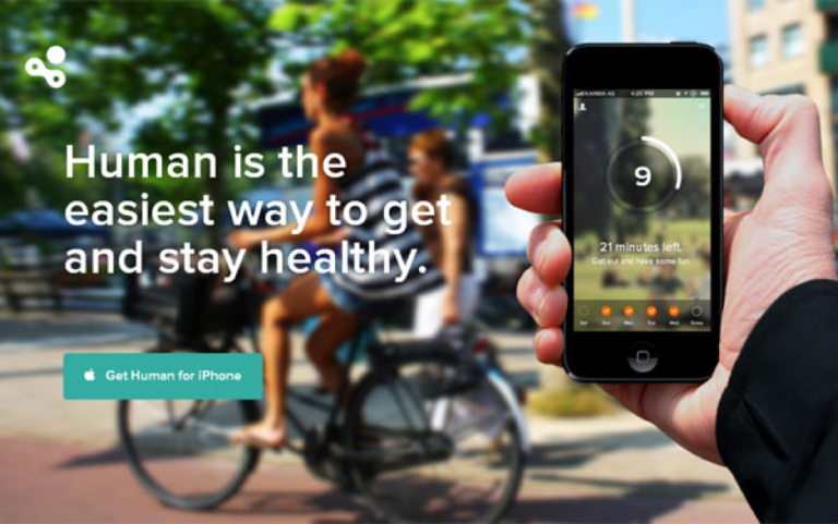
Image Source: http://www.hongkiat.com/blog/mobile-app-landing-pages/
Tempting Pitch Message
You have to create a short message that will convince the viewers to try your app. Don’t be boring and demonstrate them that you offer a valuable app which will make their life more interesting. Spendee explains its core functionality in a simple but effective way.
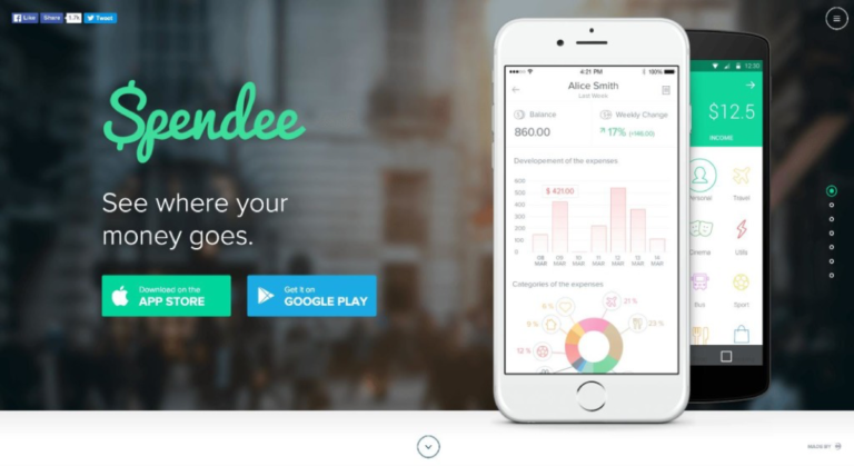
Image Source: https://buildfire.com/free-app-promotion/
Clear Call – To – Action
If people appreciate your landing page, what is the next step? If you want them to download the app or to subscribe for new features make that crystal clear. Hidden buttons won’t do the work. Place them in various locations along with the badges from Google and Apple. Do you notice the big reg button which says “SIGN UP TO GET STARTED”? Yes, it is very hard not to.
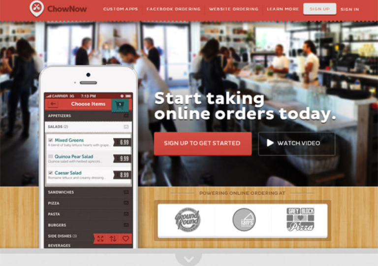
Image Source: http://www.hongkiat.com/blog/mobile-app-landing-pages/
Video Or Screenshots Slider
Another must have for your landing page is a preview video and a set of high quality screenshots. If you want to get fancy you can create a carousel to impress your users even more. This way they will know what your app is all about and it minimize the chances to uninstall it after the first use. You can see an example from Triplagent.
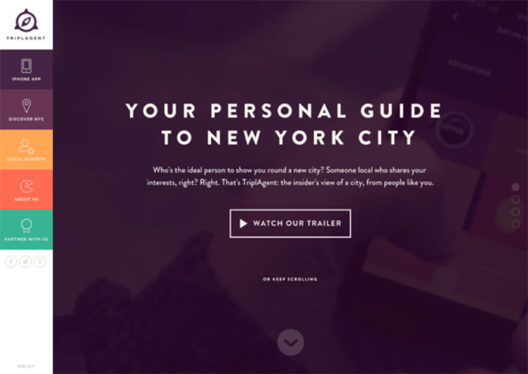
Image Source: http://www.hongkiat.com/blog/mobile-app-landing-pages/
Awards Or Contests You Won
You need to show your brighter side. S,o if you won some contests as a mobile developer or your app was mentioned by important persons then you have no reasons not to brag about that. Testimonials also help a lot. If a couple of users said something nice about your app, add their reviews here. As you can see for Lara Craft Go the prizes received barely fit the page. This is the image of amazing success!
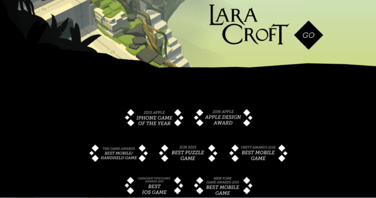
Image Source: http://www.laracroftgo.com/
Visible Contact Info
It is vital to allow people to contact you for the best and especially for the worst. You definitely want those bad reviews and some unwanted flaws to reach your eyes instead of your app store page. Make your email and other information visible for the persons who want to talk to you. Tourism App does a great job for the contact section.
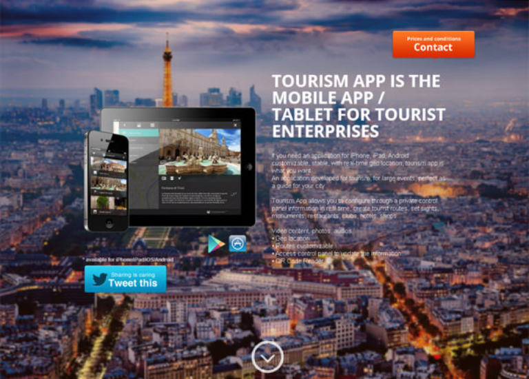
Image Source: http://www.hongkiat.com/blog/mobile-app-landing-pages/
Include Social Media Accounts
Nowadays, we can’t make the next move without checking our social accounts first. Make sure to remain connected with your users on social networks. Building a community as early as possible is the best practice for promoting your brand. You can notice the two buttons for Twitter and Facebook on the landing page of Piictu.
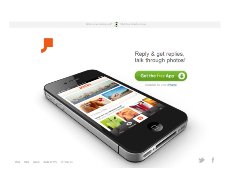
Image Source: http://www.sparkpage.com/10-fantastic-examples-of-landing-pages/
Notable Mobile App Landing Page Examples
We showed you some examples but there are so many landing page that worth our attention. As you can see Swifty offers live demo directly on the webpage. Everyone knows that coding is very hard but an app like that with such an interesting presentation makes everything appear like a five – finger exercise.
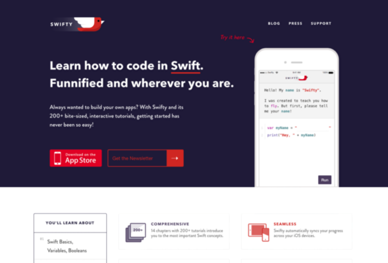
Image Source: https://medium.com/swlh/the-21-best-designed-app-landing-pages-of-2015-bb8f365c19e6#.fzkpyd9m6
If you ask yourself what to say when you create your website you should observe that GameIt showcases its awarding feature right from the start.
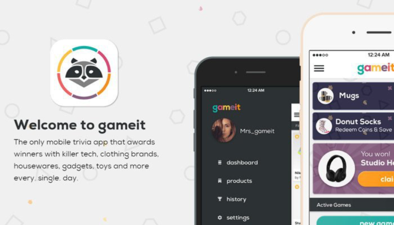
Image Source: https://webdesignledger.com/best-2015-app-pages/
Take a look at this complete app page from Taxibeat. It has all of the above and many more. You can see the main features, you are able to watch the tutorial, the call – to – action is visible and it also offers a help center. The special touch is that you have the option to see the page in your native language.
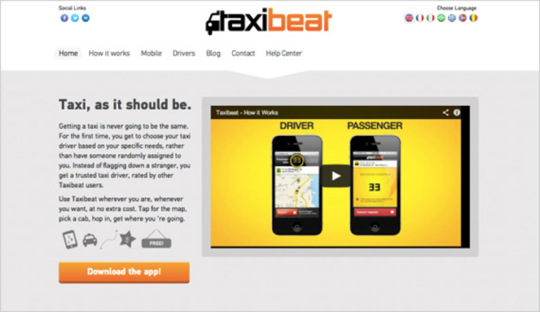
Image Source: http://blog.usabilla.com/16-inspiring-app-landing-pages-and-8-reasons-why-they-are-effective/
FINAL THOUGHTS
Today we gave you some hints on how to impress your future users with an amazing landing page for your app. Even if you have a hundred other things to do for promoting it, don’t miss this opportunity to create a bond with your users and to reveal every interesting thing related to your creation.


