Have you ever stopped to think about the number of times you have registered on a website?
Whether it was to download an ebook, access a social network, get access to an application, or reserve a place for the first commercial trip to space (who knows), all these registrations were the result of a Compelling Call to Action.
Think about it; if it hadn’t been for the irresistible power of attraction of that message or that image, you would probably use far fewer applications and websites. And it is that in inbound marketing, it is essential to know how to guide users in their purchase process to achieve the desired conversion.
Therefore, in this post, we would like to take a tour of the seven best Call to Action that very few of us could avoid clicking and a summary of the best practices for designing your CTAs. From “Call” to “Action” to make this compilation, it will not be necessary to reinvent the wheel: let’s learn from the best.
Companies like Uber or Netflix spend thousands of dollars a year testing, measuring, and analyzing the conversions of their CTAs. As you will see, each one of them follows a different style and idea, so you can adapt these ideas to your own business and see which one is better in your case since what works for a company does not have to work for you ( and vice versa).
If more delay, let’s go for them!
1. Netflix: CTA button: JOIN FREE FOR A MONTH
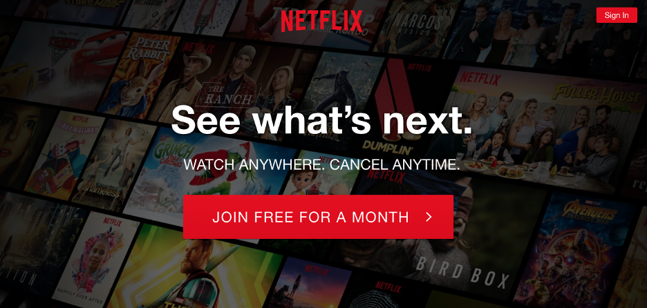
For me, it is a CTA for a book, and not only because they go to the color red, which, after all, is the color of their graphic line. If you notice, the value proposition is unbeatable: everything for a month for nothing.
Netflix nips any fear in the bud because its main conversion goal is to get the user to test the platform, and then convert them into a customer. But also, just above the button says: cancel whenever you want.
I do not risk at all in affirming that this “tranquility” alone has helped them to increase the registrations on the platform exponentially.
2. Blablacar: the CTA 2 × 1
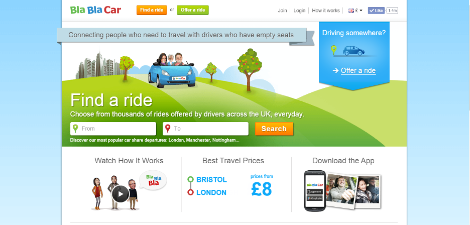
Blablacar looks for two very different types of users to register on its platform: travelers and drivers.
Both users are looking for totally different things, and yet the website ties them together nicely with two CTAs. If you notice, the action happens on the front page, but in two different modules. The photographs, together with some copies that convey the value proposition with a sentimental touch (not just transactional), manage to bring the scene together in a masterful 360 service.
3. Dropbox: the experimental CTA
CTA button: Sign up for free
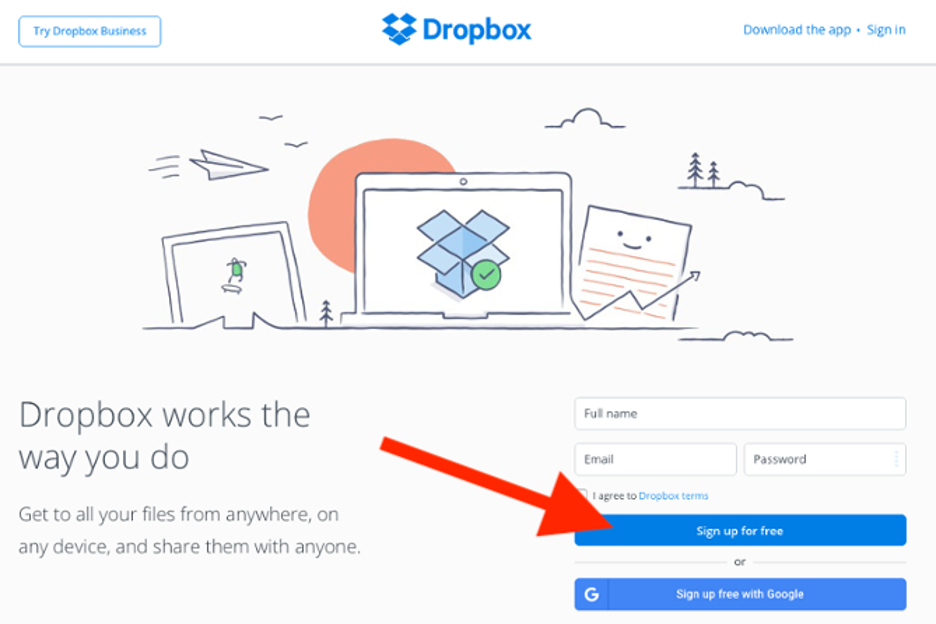
Someone had to say it. The famous cloud storage service has opted for a rather unusual design.
By avoiding the use of images, the colors on your home page are subtle and simple. I think WeTransfer quite influences this new style. In any case, thanks to that simple and negative space design, the white Call to Action button stands out above any other element.
They have also stopped basing their value proposition on the characteristics of storage to enhance the message of creativity and modernity—quite a success.
4. Instagram: the CTA straight to the point
CTA button: Sign Up
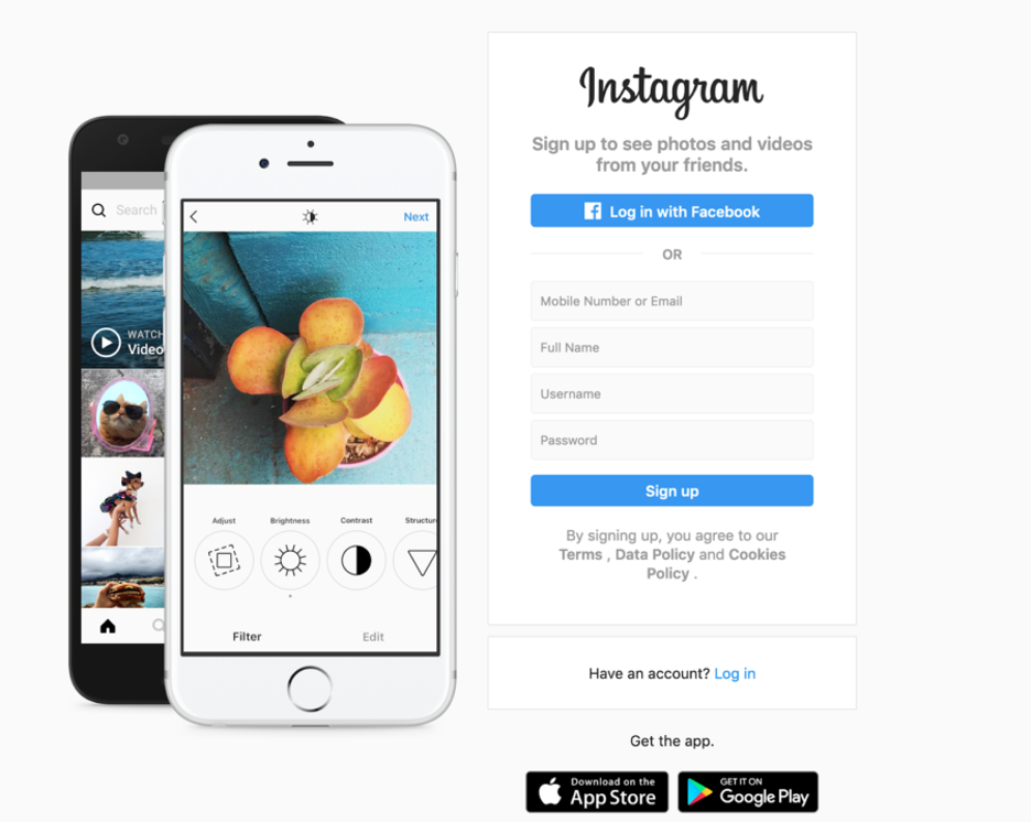
They need no introduction, and they know it. This social network is well known in the world.
And the value proposition is straightforward. If you are here it is because you want to belong: Come in. With a “Sign Up,” they invite you to fill in your contact details and finish your registration process on the home page itself to access the social network. Also, they give you the option to register directly from Facebook or download the application.
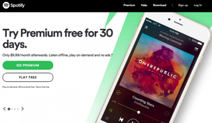
5. Spotify: the aggressive CTA
CTA button: GO PREMIUM
6. Just Eat: the gossipy CTA
Your Call to Action button itself is a magnifying glass icon, but where the action occurs is in its text field. By entering our address we can see the restaurants in our area that can bring us food home. Who wouldn’t want to know just out of curiosity?
Once you do, you are already inside. The wide range of restaurants and the convenience of use mean that in a couple of minutes, you are already registered and waiting for your delicious delicacy to be brought home. Also, they create context by theming the web. In this case, they use the soccer theme of the World Cup in Russia to convey the message.
7. Apple: the anti-CTA
CTA button: (NO!)
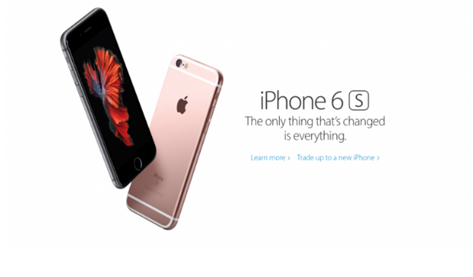
You’re looking good, there just isn’t any CTA button. Always at the forefront of simplifying and innovating, its value proposition has also translated into its call to action. Apple has opted for a minimalist design: an image of its new phone that acts as a CTA, dispensing with any type of button. The copy of the message is also along the same lines, simple but forceful: Say hello to the future. Even in this case, Apple has been able to create a new current of thought, questioning everything that has been established.
8. Grammarly
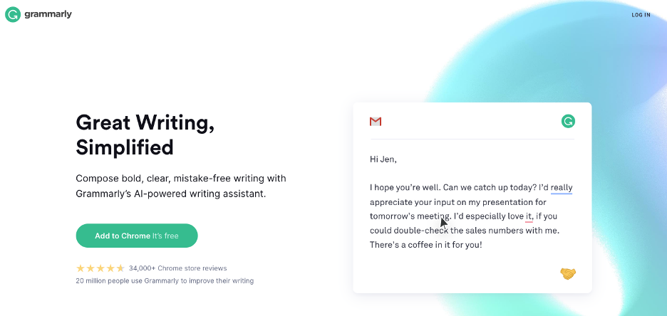
Grammarly uses a value its own CTAs. “Add to Chrome” and “It’s free”. Very simple.
9. Square
CTA button: Get Started
To achieve an effective design, you should not focus only on the button: other elements are also very important, such as the background color, the images,, and the text that accompany the CTAs.
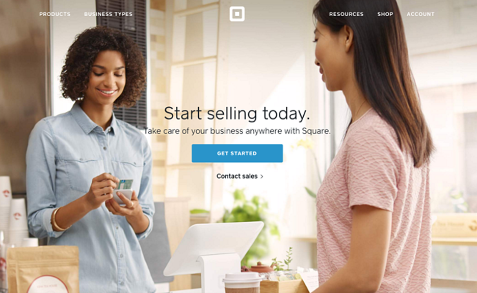
The Square team takes these additional design components into account and includes a single image with a simple CTA to suggest that their product is user-friendly. If you look closely, the image’s credit card color matches that of the CTA button, allowing the visitor to associate it with what they’ll find if they choose to click.
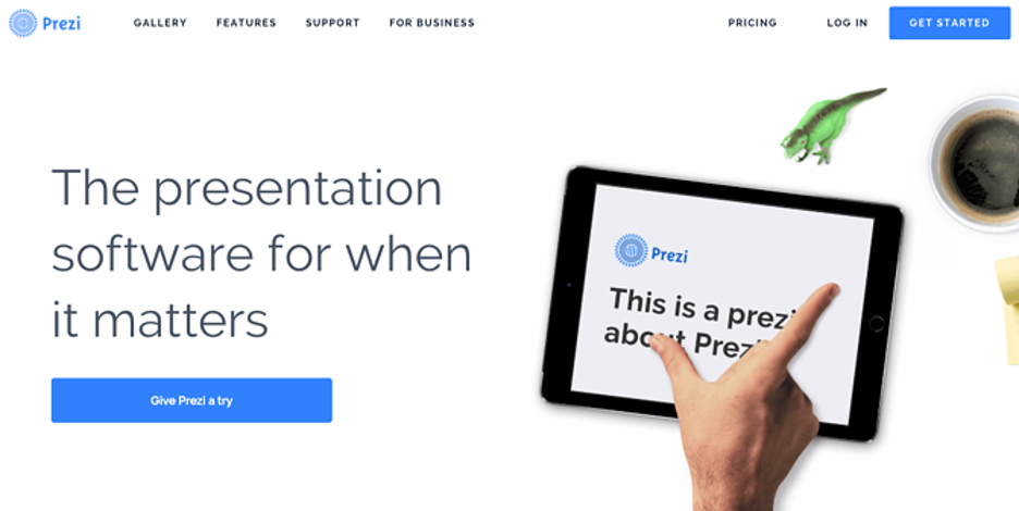
10. Prezi
CTA button: Give Prezi a try
The Prezi team also adopts a minimalist design on their website. Aside from the green dinosaur and dark brown coffee, the only color that accompanies the predominantly black and white design is bright blue – the same as its main logo. That color is strategically placed on the front page: on the main call-to-action, “Prezi Test,” and on the secondary, “Let’s get started.” They both take users to the same pricing page.
Conclusion
Let’s summarize the lessons we’ve learned from looking at these great Call to Action examples:
- Try to reduce the risk of your user to the minimum possible.
- Not only is the CTA important, but it’s also its context.
- Use a CTA for each type of user you target.
- Try to combine the colors and elements to make your CTA stand out.
- Get to the point, reduce the number of steps as much as possible.
- Once you have a good user base, don’t be afraid to make your value proposition more aggressive.
- If your buying process is long, try turning your CTA into an interactive element that arouses curiosity.
- Question everything, even if it means discarding the use of CTAs
- As you can see, there are infinite possibilities for your Call to Action.
It is up to you to see what works best for your business.
Remember: testing and measuring is the recipe for success.
Could not generate text at this time.
…unique formula that taps into psychology, design, and timing to capture your attention in just seconds. Take Netflix, for example, with its famous “Watch Anywhere. Cancel Anytime.” CTA—simple, direct, and packed with value. It speaks to the binge-watcher in all of us while removing any fear of commitment. Or think of Amazon’s “Add to Cart” button, strategically placed and brightly colored, urging you to take one tiny step closer to instant gratification. Great CTAs don’t just ask; they *persuade*, using curiosity, urgency, or exclusivity to make the offer feel irresistible. As you scroll through this list of click-worthy examples, you’ll notice a pattern: they’re not just words on a button—they
…set of principles that blend psychology, design, and user behavior to perfection. Take Netflix, for example: their iconic “Join Free for a Month” CTA didn’t just invite you to try their service—it promised a no-risk, all-reward experience. It’s short, clear, and packed with value, tapping into the human desire for instant gratification without commitment. Meanwhile, companies like Dropbox keep it minimal yet effective with CTAs like “Try Dropbox Business Free,” using simplicity to eliminate decision paralysis. What these examples teach us is that the best CTAs aren’t just words on a button—they’re a doorway into a solution, a spark for curiosity, or an invitation to improve your life. Crafting your own irresistible CTA means thinking like your

