
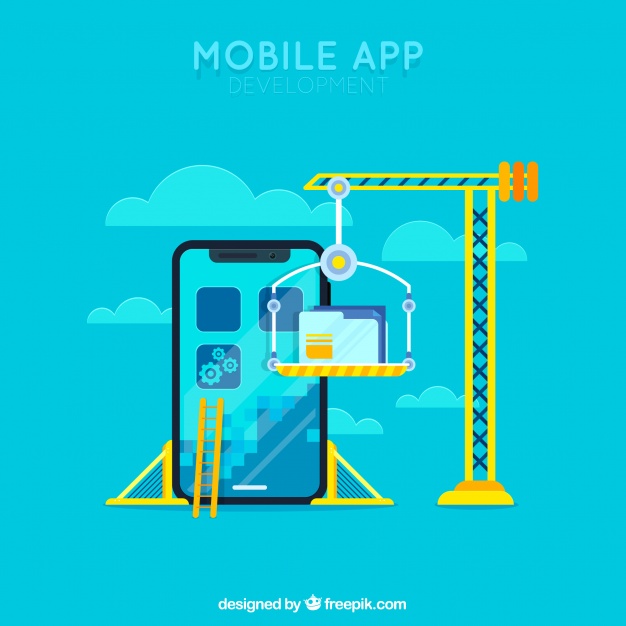
Having a mobile app is slowly and gradually becoming a must for your business or your website. U.S. consumers spend an average of around 5 hours on their phones daily. Out of these 5 hours, 92 percent of the time is spent in apps, with just 8 percent being devoted to browsers.

However, a lot of businesses and website owners are starting to realize this and the number of mobile apps available to users is growing every day. With an average smartphone user having around 80 apps installed, competition is fierce. In such circumstances, top-quality design can make all the difference. Obviously, when it comes to mobile apps, having a good design means a lot more than just good looks. It also means flawless functionality and a first-rate user experience.
As App Samurai, we are giving practical points, techniques and guides for mobile app design. One of our past posts, we have talked about the basic mobile app screens as an inspiration. Now, it is listed 8 fundamental things you need to pay special attention within the process of app design.
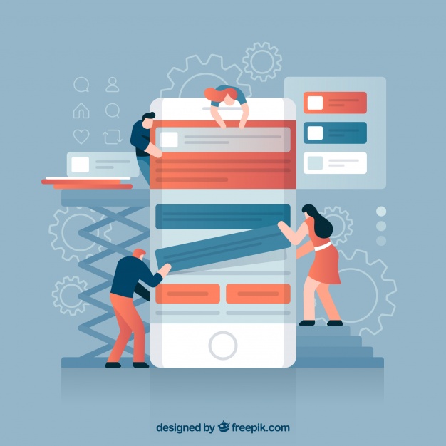
Decluttering and Speeding Up
The first and most important rule of UX design is to make the app simple, understandable and easy to use. Everything you do, you do with the end user in mind and you ought to avoid everything that could make their life more complicated.
With that in mind, the first step is to declutter your app and get rid of all the unnecessary features and design elements. This is done for two reasons. Firstly, you don’t want your users to be overwhelmed and confused with an enormous amount of objects and info on their screen. Secondly, it speeds up your app, and speed is a huge UX factor, especially given the fact that people are getting more impatient as their attention spans are constantly shrinking.
You need to keep your content short and on point, using progressive disclosure whenever possible. Put only the core content in front of users’ eyes and try to be as minimalistic as possible, without omitting any essential info. Use every chance to improve your app’s performance or at least employ little tricks to keep your users distracted while loading is taking place. These tricks include prioritizing loading for elements that appear in the visible part of the screen, using skeleton screens as well as utilizing simple amusing animations that would keep the user occupied until the content is fully loaded.
Break and Offload Tasks
In the same good spirit of simplicity, you need to break the tasks into little steps. Try not to burden the user with more than one action per screen. For every complex action that requires multiple moves, create multiple screens that have a logical connection and succession, understandable to everyone. Trying to squeeze everything into one screen can only get the user overwhelmed and your app cluttered, which brings us back to the mistakes explained in the previous paragraph.
Another important rule of UX for apps is to make things not just simple for users, but also familiar and predictable. And in the context of navigation, this means sticking to standard patterns and gestures. Custom-made elements may be more challenging for a designer in a creative sense, but the priority here is that the users are able to easily discover and understand your app’s navigation patterns.
That’s why you need to make navigation visible and create an information architecture that’s simple and logical. Let your users reach their desired screen in as few steps with as little effort as possible.

Hierarchy
Same goes for visual hierarchy – you have to make it obvious for the users which elements on the screen are most important. Just like in other areas of web design, this can be done by using fonts of different sizes and types, blank space, caps lock, title case, as well as different colors.
The intensity and brightness of the colors can tell you a lot about the importance of an object on the screen, thus you should always make your CTA buttons stand out. You can do this by using contrast or by simply filling the crucial buttons with a more intense nuance of a color. This helps not just the user to understand your intentions but also helps you convert or suggest the user to take any type of action that you find desirable.
Optimizing User Input
As much as your users can be overwhelmed by the number of elements on the screen, they can also be demoralized by the amount of input they’re expected to provide. Especially when they have to type it on a small screen of their smartphone.
That’s why you need to ask only for the info that you absolutely have to know – they’re certainly going to get discouraged when they see a 15-slot form, even when not all of these are obligatory. Among other things you can do to make their life easier, you can use the auto-complete or auto-suggest feature, input masks, customized keyboards for different types of input, or you can pre-fill the slots with most likely choices and values. Finally, providing visual feedback for any sort of interaction or input is an absolute must.
Touch-Friendly Design
On the same token, making it easier for the user to type and interact means optimizing your app for touch. There’s nothing as irritating as a small touch target and this can chase away a lot of your users and make them abandon or uninstall the app. Most of the top web design agencies go for targets sized at least 10 by 10 mm, as a human fingertip can usually comfortably fit this space. Also, it’s vital that you don’t forget to leave enough space between two adjacent buttons.
Consistency
A crucial design principle that should be respected when dealing with any of the abovementioned issues is consistency. A natural consequence of being consistent and keeping the amount of design-related surprises to a minimum is predictability. Making your app predictable means making it easy for the user to understand it and to find a way around it.
Don’t make people put any unnecessary additional effort in order to smoothly use and navigate your app. This means that your navigation patterns, buttons, tiles, dialogs, principles of hierarchy and your overall visual identity need to remain the same across different parts of the app. And not just that – it’s also desirable that there is a substantial amount of consistency between the mobile app and your desktop website, as well as with visual solutions you use for your brand in general.

Test, Improve, Repeat
Once you’ve done all this, the job isn’t finished yet. Actually, it’s never finished. The app needs to be tested over and over again and the user feedback will provide you with some valuable info on which aspects of the app need improvement. You’ll never get a perfectly user-friendly, bug-free app with impeccable performance and exquisite functionality. There’s always room for improvement, hence app design is a never-ending job of fixing errors, revising old solutions and accommodating to new trends and tendencies.
About the Author
Meaghan Yorke is a web designer who is quite passionate about writing. These days she is all about researching various IT related topics. When she is not working she enjoys dancing classical ballet.
