
Don’t you love when you see on those small screens of smartphones that all the elements move in a natural way just like in real world? So are your users. Why don’t you use motion effects to build a connection between your customers and your app? Read further if you want to discover how to do that.
Motion Effects Boost Usability in Mobile Apps
Besides the amazing aspect provided by animations, there are other reasons why you should consider their implementation for improving the user experience.
There are a couple of ideas we need to mention when it comes to the effects of adapting animations to your app’s style.
- Whenever you want to discover the efficiency of certain elements for impressing users you have a straight path to find the answer. You open the official documentation from Apple and Google. Both platforms have special sections where the use of motion effects is encouraged for improving app interface.
- Before starting anything else you must consult the guidelines for Android and iOS apps.
- Keep in mind that it is a fine line between an amazing and an annoying app and you need to pay attention not to cross it. If your effects intrude and complicate users’ actions it is better to forget about them and to use static activities.
For our further statements, we will go with the premise that a well-designed animation has its own purpose and it comes to increase users’ engagement.
[clickToTweet tweet=”How boring is your mobile app? #appdev #gamedev #androiddev” quote=”How boring is your mobile app?” theme=”style6″]
14 Ways To Use UI Animations For Better UX
Let’s see some of the major cases when UI animations make the difference between a boring app and a wonderful experience and in what way those creations have the power to engage users and to make them more attached by your app.
Pull Down Experience
Pull down to refresh is a motion effect that became a natural move for most smartphone users. An animation that grabs customers’ attention while the next activity is loading can provide impressive results. Take for example Fitness Tracker where a small human figure walks on the screen for a few seconds to remind users what type of app they are using.
![]()
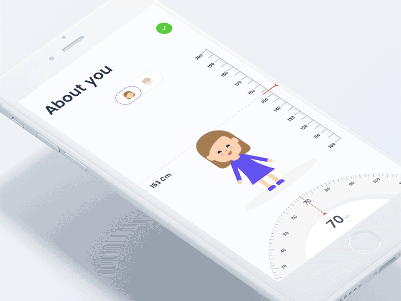
Engaging Onboarding
One of the essential places, when a well-designed animation is meant to impress users, is during the onboarding flow. Inviting them to interact with your app trough visual elements will convince them that it was a great decision to download your app. Imagine how intuitive is the following onboarding example for the first time when you enter a diet app.
Excellent Loading Experience
During the loading process, before displaying a new activity inside the app, you need to convince users to focus on other elements in order to make them forget about the time spent for the next screen to appear. And some delightful animations will do the trick, like the ones created for this chat app that uses a wire to gather all the friends from the list.
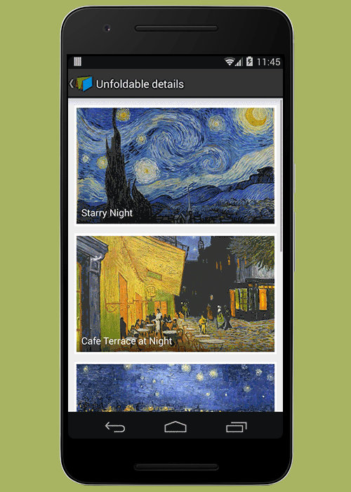
Entertaining App Walkthroughs
App walkthroughs have to be interesting when you want to convince users to proceed to the next action inside your app. A well-crafted animation will help you to avoid the feeling of a boring presentation. Take a look at the following visual design from Devin Ruppert which transforms even the most complicated app into an enjoyable adventure.
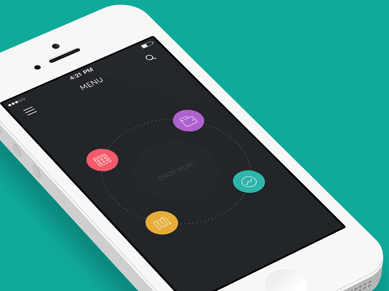
Navigation
This animation is the best way to simplify the navigation structure. List of app categories turns into a visual navigator. The example below, navigation bar turns upside down when a user presses the button. Thus, the user can transport reasonably between navigational contexts.
Interactive Tutorials
With animations, you have the possibility to guide users through your app or game without the need of throwing a lot of boring words on the screen. As you know it is better to show than tell. It is harder for users to complete a certain task, even more, when money is involved in the process. This interaction overview makes things a lot simpler for customers.
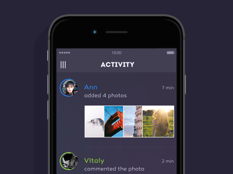
Provide Clear Feedbacks
Users always need a confirmation that they are on the right path when they use your app. Visual effects are a great way to make them understand if their actions have the wanted effect and why. The checkmark that appears after they complete a payment, for example, gives them the feeling that they need to relax because everything is fine now.
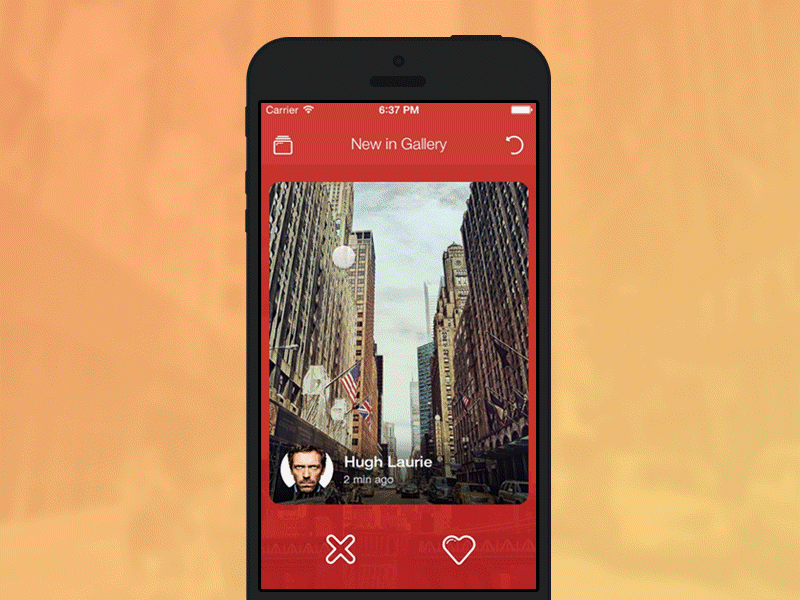
Visual Feedback
Visual feedback is a way of responding to user’s input. It is the basic point in UI and UX design of apps. Also, it means your app is working properly as something is happening on the screen. The best example is Tinder. Its swipe-left-to-like-right-to-pass also refers to visual feedback animation type. Like Tinder, Koloda has implemented this animation in their open-source library.
Displaying The Elements
Thanks to animation, app elements can change their view or functions. You can describe the transformation of specific parts in the app and illustrate the way they interact with each other. It engages users if you add animations indicating changes rather than adding a button starting a slide from the side of the screen.
Excellent Transitions
There is nothing worse for a user than passing from a screen to another without a connection between them. A transitional effect will help them to avoid that confusion. Just observe the smooth actions inside Life minimal app with great visualization.
Dynamic News Feed
When designing an app it is important to create all the elements in a special manner and to invite users to continue to the next page. This is the case of any news app where a simple tap on the title expands the entire content and it reveals more information. We recommend you to check the UI navigation concept for this type of creation.
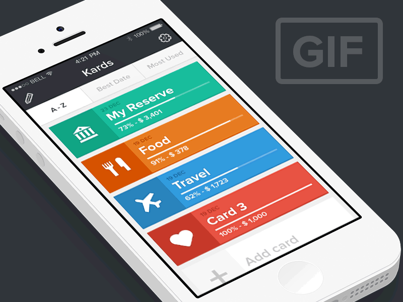
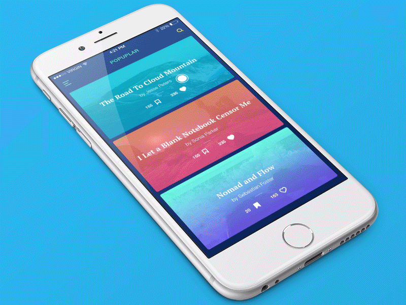
Card Animations
Using card inside an app is a neat way to present all the data without overloading the visual aspect. When you have to say something more than a few words, an organized structure is all you need. And it is even better when you use 3D touch interaction for providing motion effects like the ones presented in the following Travel Blog app.
Button Interactions
Where is a great demand for animated effects if not in a zone with buttons? They combine the functionality with impressive aspect and customers expect to be surprised after they press the little-colored space. For these elements, the design is limited only by your imagination. An interesting way of adding a Search button on the screen is presented by a prototype for MarketMe.
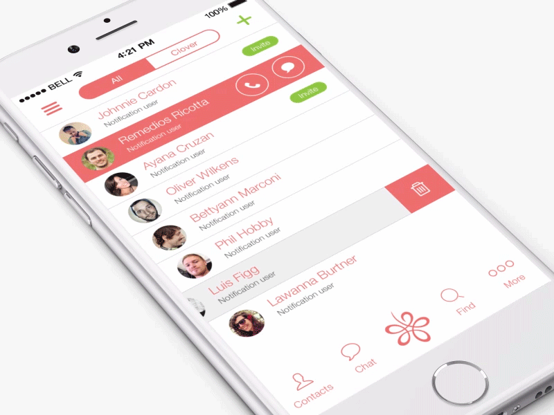
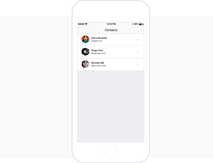
Interactive Contact List
Another part to implement an animation is a contact list. As you know, generally, it is ordinary. I mean you need to tap a button and enter the contact profile to delete or share something. However, there is a good example of showing that it doesn’t need to be like that. Justinmind created an interactive contact list using dynamic panels and table widgets. You just swipe the contact in the contact list and add events like deleting.
FINAL THOUGHTS
Animations are meant to provide the feeling that mobile devices are more than handsets for completing various tasks. Users can do everything in a pleasant way if they are encouraged by smart effects added to your app. Move beyond ordinary apps and make your product a generator of unforgettable experiences.
Could not generate text at this time.
…using UI animation strategically. For example, think about micro-interactions—those subtle, delightful animations that respond to user actions like tapping a button or swiping a card. These may seem small, but they pack a big punch in terms of user satisfaction. A loading spinner can transform into a playful bouncing ball, or a confirmation checkmark can glide into place with a satisfying flourish. These touches not only make your app feel alive but also provide visual feedback that reassures users their actions are being acknowledged. It’s the little things that make your app memorable, turning “boring” into “brilliant” with just a touch of creativity and motion!
…using UI animation to breathe life into an otherwise dull interface. Imagine a loading spinner that morphs into a checkmark when a task is complete, or buttons that subtly bounce when tapped, giving users instant feedback. These little touches don’t just look cool—they create an emotional connection, making your app feel more human and responsive. When done right, animations guide your users, reduce cognitive load, and even add a dash of delight to mundane actions like filling out a form or navigating between screens. It’s like adding seasoning to a dish—without it, the experience may still work, but it’s missing that extra spark that keeps users coming back for more. So, why settle for static when you can make your app dynamic and memorable?