Do you want to create a successful and efficient mobile app payment screen? Then, you need to pay attention to various details.
People expect you to give them a good reason to pay for an app. There are many apps that require payment before downloading or in-app purchasing to reach more features in an app. However, people mostly tend to be skeptical about these apps considering if there is a possibility of fraud or if the app really deserves to be paid. This is why app owners have to work hard on creating a mobile app payment screen to convince people to make a purchase.
Do you also have a mobile app that requests people to make a purchase? If your answer is “YES”, you are on the right page!
Until the payment screen, you should design the whole purchase process to prove your value. People need to see that you give them value before they become voluntary to pay you. You cannot just expect them to enter their credit card information easily.
The very first thing to do after making them be interested in your offer is to promise them their information will be safe in your hands. When money is the subject, you have to be trustworthy. Or else you will only accomplish to make sell by chance. This is not a very effective monetization strategy.

Creating a trustworthy and convincing mobile app payment screen is really important. So, let’s have a look at the tips for creating a mobile app payment screen.
Table of Contents
Let People Know About Security Measures
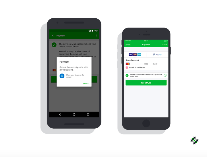
The very first thing people care about when it comes to sharing credit card information is a safety. Mobile app payments are not excluded from this fact. You can make people feel secure in your app by really keeping them safe.
The Internet is full of reviews and you cannot escape from bad reviews about security flaws when you cause your users to experience fraud. Do your best to keep them safe and let them know how you do that. For example, people trust PayPal and Shopify. If you are cooperating with them, tell your users about this at the beginning. So, they will tend to pay for your mobile app.
While creating a mobile app payment screen, try to be specific and clear about the steps.
Eliminate Error Messages
After safety, there comes an easy transaction. If you want people to pay for your app, design your payment page in a simple way. Believe me, most of your potential customers would not enter their credit card information twice even if they totally LOVE your mobile app.
Make sure that there is no bug to bother your users. Error messages are your archenemy on your way to gain customers. They cause you to lose the trust of your users. App maintenance is, accordingly, very important for a long-term relationship with your users and to gain their trust. Never let your mobile app payment page be downloaded slowly. Update your app when necessary to eliminate error messages and to increase the speed of download.
Be Aware Of Your Own Features
Developing and upgrading your app is very important for having long-term users. UX is the king when it comes to convincing your users to pay for your app. A successful mobile app payment screen requires you to be aware of your own feature that can be considered as advantages and disadvantages.
If you do not know what your users are experiencing on the payment screen, you cannot solve problems and provide them with a better experience. Try to create happy users who give their credit card information voluntarily. Qualitative and quantitative analytics and user feedbacks are perfect sources for getting insight.

Be Compatible With Different Devices
People use various devices with different screen sizes. UX design becomes a hard work considering this variety in the market. If your user cannot find a “BUY NOW” button easily, they will probably not be your customers. You need to make sure that your mobile app payment page can be displayed correctly in every device. Especially if your app is for Android users, the number of devices will be surprisingly high.
Keep The Transaction Process Short
People do not like waiting! Make sure your transaction process for payment is really short. Do not let your users change their mind before completing the process. Fast downloading, as we have already mentioned is a good step for that. But, you need to find out more ways.
You can lead your customers on the payment screen with a clear design. Dashes between every four digits as seen on the card or including the initials for days such as MM/YY provides users with a better experience.

Conclusion
If you want your users to pay for your mobile app, the very first thing to consider is a safety issue. Nobody wants to enter their credit card information where they keep their money on an insecure or ambiguous payment page. Highly secure payment environment provided in a perfect UX design is the key to convince people to pay for an app.
You also need to let your users complete the process easily in a short period. They may get bored or lose their trust when it takes longer to make a purchase. Even in a physical show, people give up buying things when they see long queues. It is just a click away to leave your payment page. Help them pay easily by guiding them kindly and clearly during the process.


