App icon… Here is a great 2024 guide. (This post is updated in February 2024!)
When developing a mobile application, one of the key elements that should never be overlooked is the design of the app icon. These app icons are more than just decorative symbols; they serve as the first impression of your app to potential users browsing the app store. Why are app icons important in ASO (App Store Optimization)? Simply put, a well-designed app icon can significantly boost visibility and conversion rates. It’s the visual anchor that helps users instantly recognize your app amidst a sea of others.
Following iOS app icon guidelines is especially crucial, as Apple’s strict standards ensure that icons for apps maintain a high level of design integrity. All apps’ icon designs should be sharp, clear, and representative of the app’s core function or brand. For mobile development, crafting the perfect icon involves considering the right app icon images that resonate with the app’s purpose and stand out in various app store icon sizes. In essence, app icons are not just mere ‘app symbols’; they are a vital component of the user experience and play a significant role in the app’s success.
The internet provides a plethora of statistics and studies which prove the importance of an app store page for the success of a mobile application. This article is meant to inspire you for an essential part of “How to Make a Perfect ASO”. We will cover the best practices in creating an amazing app icon since this element is like a business card for your app. Users must understand what your app is about by just watching its icon. As an example, you have a confession from Richard Wagstaff, a mobile developer who doubled the number of installs after he reconsidered the way an icon was drawn for one of his apps.
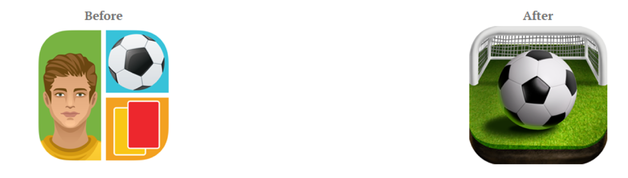
Image Source: http://www.rjwagstaff.com/
7 Tips to Design a Compelling App Icon
We will discuss app icons in general, because the significance is equally true in both cases, whether you are creating an Android or iOS app. To start, look at the following list for image editor apps and think about your feelings regarding each of them. Which one is your favorite?
![]()
Avoid Text For First Impression
Are you thinking to add text to your icon? Well, how are you planning to squeeze those letters on such a small layout and people could still read it from their small devices? Yes, that is right. It was a bad idea. Even if you imagine that you discovered the best word that will influence users you can add it to your app title, which is right near the icon. It will have a better impact since that is the exact place where people expect to be impressed by text. It is better to observe these mistakes before you invest a lot of work for nothing.
Make It Consistent With Your App To Make Remembering It Easy
Every user that gets on app market is searching for something that makes him realize he found the exact app he wanted without any effort. The icon must explain the mode that your app will serve him. Not all persons are willing to read titles and descriptions and they only focus on the images gathered in that list which appears after he looks for some keywords. You want your icon to jump ahead and to say: “Pick me! Pick me!”. We are speaking metaphorically, of course, but you got the idea!
Be Sure That It Is Unique
An attractive icon is not necessarily something that people see everywhere around them. An image that catches their attention will be a different pattern than others that can be found in the infinite list of applications similar to the one you have. There are very few developers with great design skills. If you aren’t one of them, you can ask someone with talent in this domain to help you. Communicate your ideas and he will share his opinions. You can’t do everything by yourself. A brainstorming will give you the results you are looking for.
Be Careful! Colors Matter
This is more of a psychological issue. The colors get in users’ heads and some of them remain there. Start by studying your competition. What colors do they use? Make sure that yours is different and it is more obvious than others. On the other hand, if your brand is known in some manner and you fixed color for its logo, then you can use that. Or even a version of your logo would function to be recognized by customers. At the same time, you need to avoid the situation when your app will mingle with any background when users will have your app installed on their devices. For this problem, you can add some borders to ensure a great appearance in every environment.
Keep It Simple
You don’t want to mix more graphics in such a tiny space because people won’t be able to understand anything. Remember that you need to make a positive impact, not something that will make viewers to avoid your app. Concentrate on just one symbol if you want to stand out. Remember that clarity will emphasize the main theme of your app. It seems crazy that all your success is relying on such a basic item but we are living in an unfair world and we need to adapt our weapons to its rules. Trust us, since we are showing you with our articles how to fight for user acquisition and after that for user retention.
Design It By Considering The Ideal Sizes
There are so many devices with multiple screen sizes which can make you so confused that you don’t know how to handle the entire process of creating a great icon for your app. Luckily, both platforms, Google and Apple provide solutions and offers some detailed guidelines which can help you clarify all your ideas and to give all your users the same extraordinary experience. For Android Developers you can check Android API Guides For Launcher Icons and for iOS programmers, there is iOS Human Interface Guidelines For App Icon. Follow all their good practices and advices and you will know what to do for adjusting your icon to the main screen sizes. We are showing you some snippets to understand better in what way they can be so helpful.
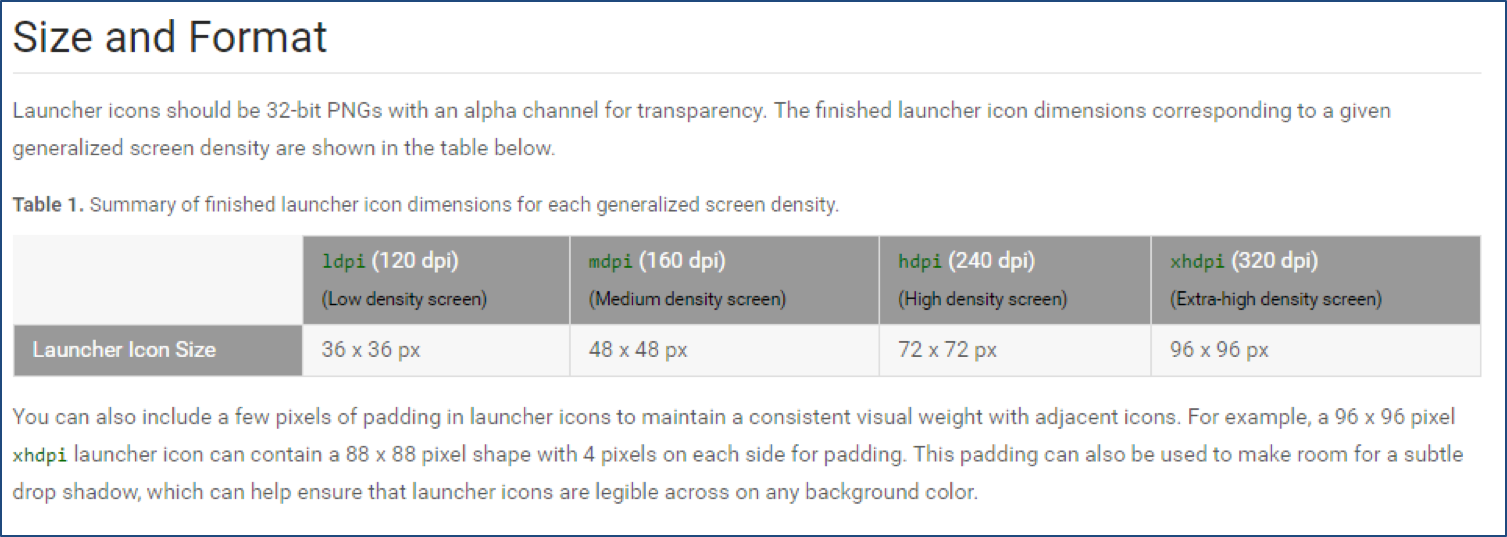
Image Source: https://developer.android.com/guide/practices/ui_guidelines/icon_design_launcher.html
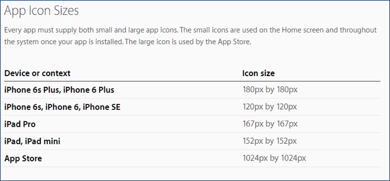
Image Source: https://developer.apple.com/ios/human-interface-guidelines/graphics/app-icon/
Don’t Forget A/B Testing
After you read the above observations, you have several options that you think they will be established in users’ minds. But which one is the best? The solution to your dilemma is A/B testing. In a previous article, you can find the Best Practices and Tools For A/B Testing which can help you to choose the right direction for your plan. This way you will have full control over your decisions before submitting your app to the app store with unknown effects.
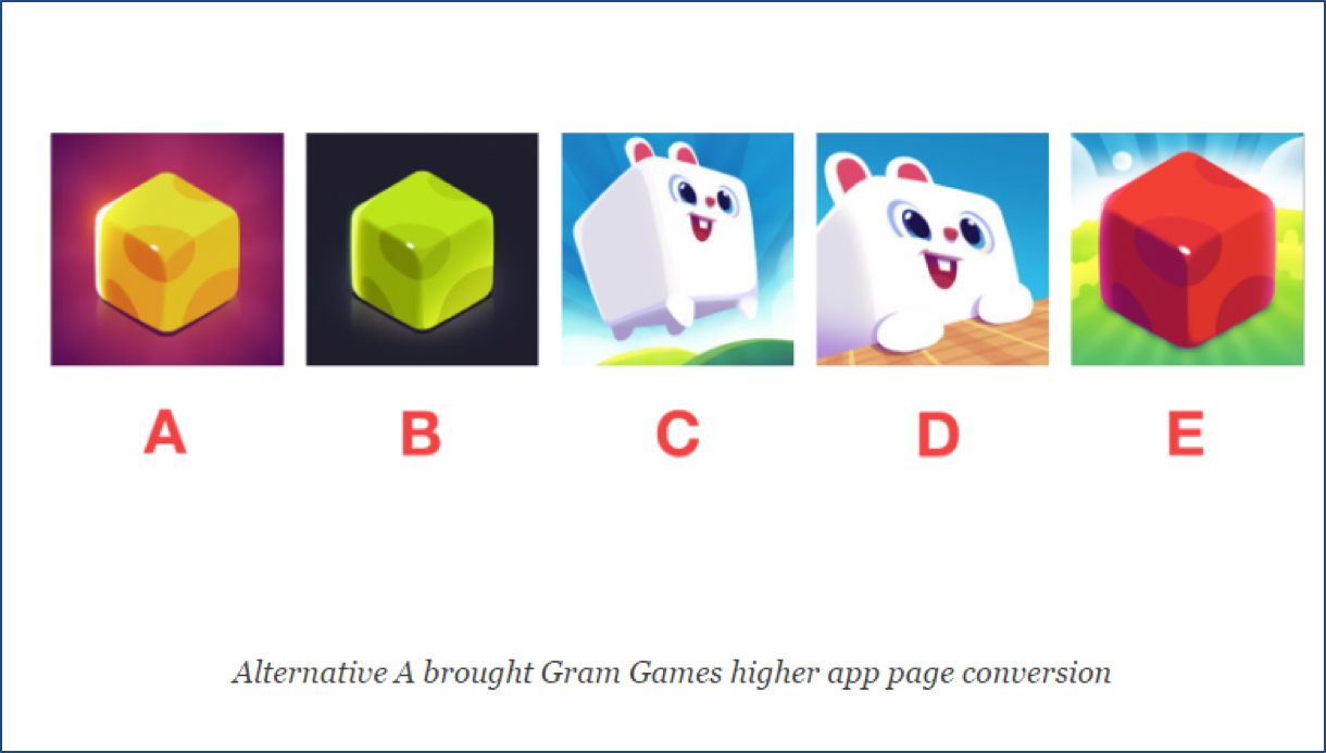
Image Source: https://splitmetrics.com/blog/the-icon-wars-how-to-increase-conversion-with-360-app-store-optimization/
Final Thoughts
The app icon can make your app pop up in front of a possible user. Even if nobody admits it, it is known the fact that we all judge books by their covers. In this case, we judge apps by their icons. With the above advices you can manage to create a powerful icon, relevant for your app with the purpose of convincing viewers about your professionalism and transforming them into users.